This post is adapted from a paper I wrote for a seminar I took on the history of art conservation. Using Leonardo’s famous painting as a case study, it warns against the overinterpretation of imaging data and the presentation of the data using visual reconstructions.
In 2007, French engineer Pascal Cotte began an extensive analysis of Leonardo da Vinci’s Lady with an Ermine (ca. 1489) using his proprietary software, the Lumière Technology Layer Amplification Method (LAM). He collected 1,500 multispectral images, each consisting of 240 million pixels. Comparing the images digitally in post-production, Cotte developed the hypothesis that Leonardo painted the Lady with an Ermine in 3 successive stages. His findings – presented as a series of colorful reconstructions (Fig.1) – were widely published in the media.
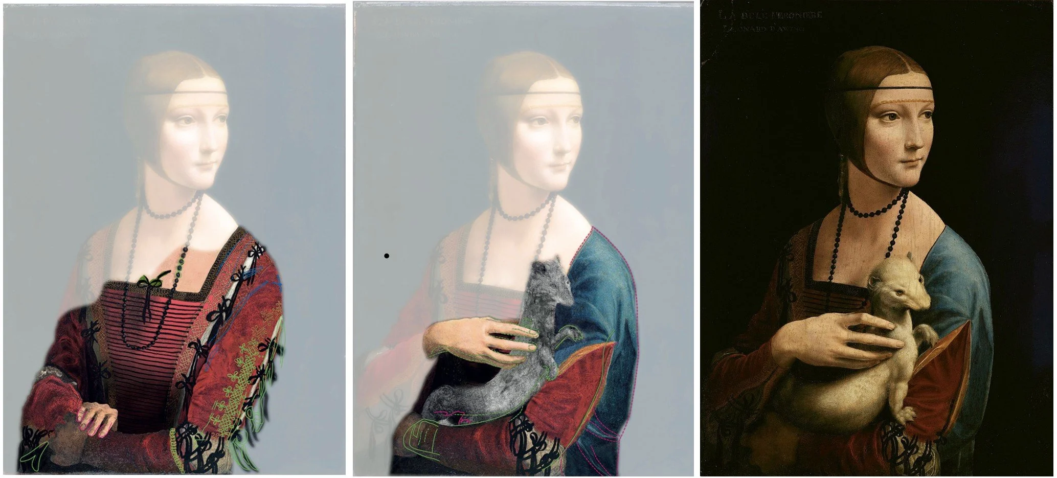
Figure 1. Cotte’s reconstruction of Leonardo’s sequence using the Layer Amplification Method (LAM). He speculated that in Stage 1, Leonardo painted no ermine. In Phase 2, the Lady held a gray, skinny, ferret-like creature. Finally, in Phase 3 Leonardo created the rotund, anatomically-exaggerated white creature that we are familiar with today.
There is no doubt about the sophistication of Cotte’s technology, which allows for unprecedented visualization of the painted layers underneath Leonardo’s paintings. The LAM images confirmed, for example, that Leonardo initially drew a series of interlaced knots on the Lady’s left shoulder (Fig. 2).
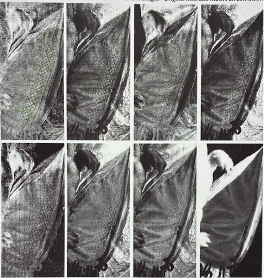
Figure 2. Cotte’s LAM images verified that Leonardo initially painted an intricate knot motif on the left shoulder. It was later covered with a bernia – the brilliant blue mantle fashionable in late fifteenth-century Milan that we see today.
However, Cotte’s use of evidence to reconstruct the painting sequence is less convincing. Take, for example, Cotte’s justification for Stage 1, in which the Lady positions her hand on her wrist. The forms he identifies (Fig. 3) do look a bit like fingers, but how can we be sure they do not equally suggest some other form?
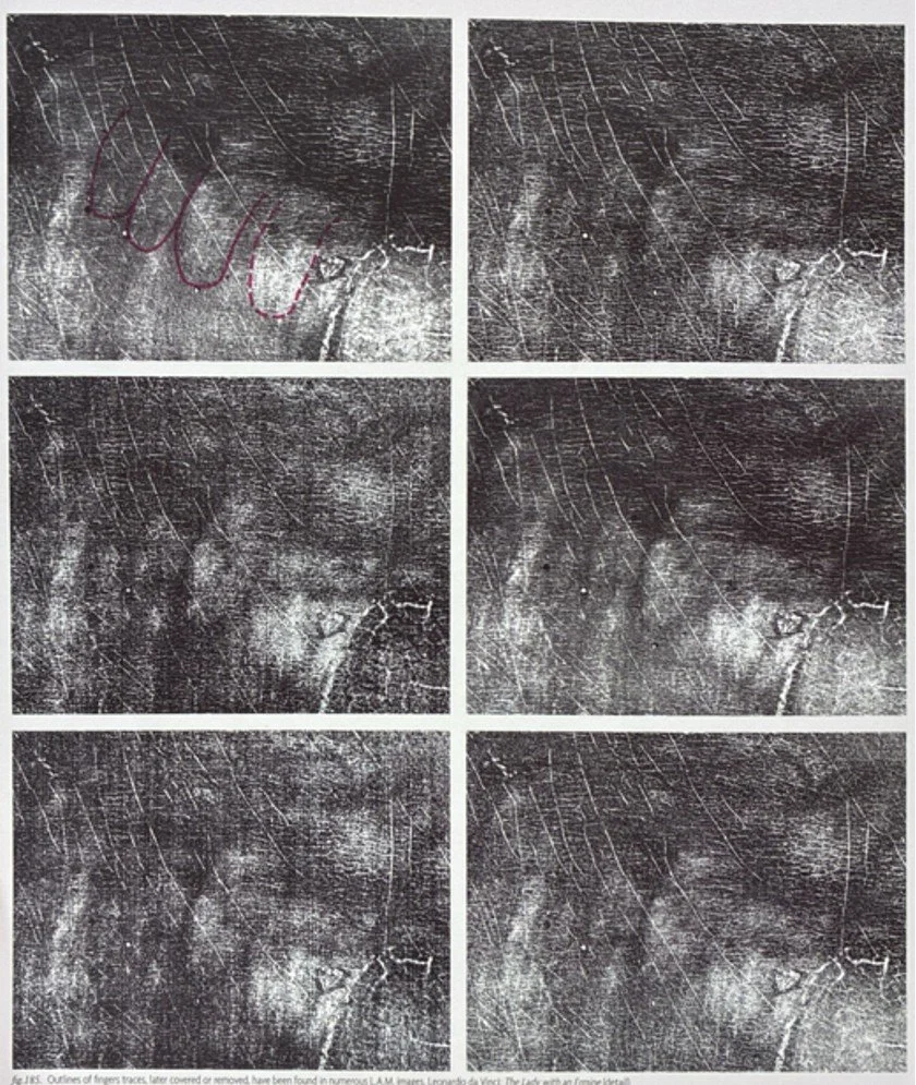
Figure 3. The “fingers” are identified with purple.
On a similar note, Cotte reconstructs the skinny ermine of phase 2 using “forelegs” that he identifies in the LAM images (Fig. 4). But might those be dark areas be part of Leonardo’s study of the musculature of the ermine’s paw?
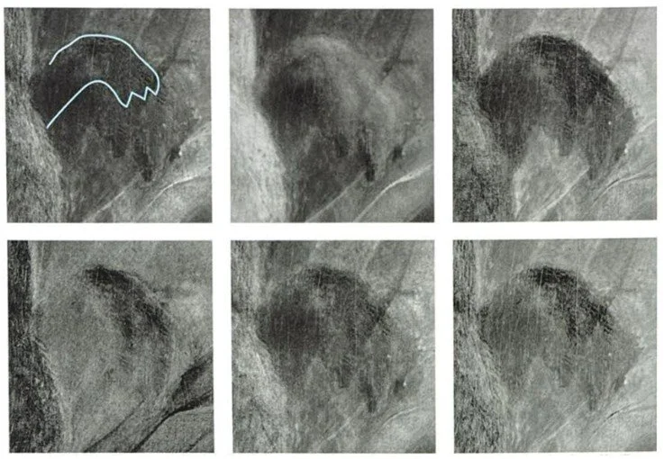
Figure 4. The paw of the smaller ermine is outlined in blue.
Finally, there is the dark shadow running along the side of the ermine, which supposedly defines the lower contour of the Phase 2 ermine (Fig. 5). However, this may be a shadow. Leonardo was known to add shadows after he had transferred his drawings, sometimes outlining them with brush and ink. This helped him to neutralize the light reflected from the gesso beneath.
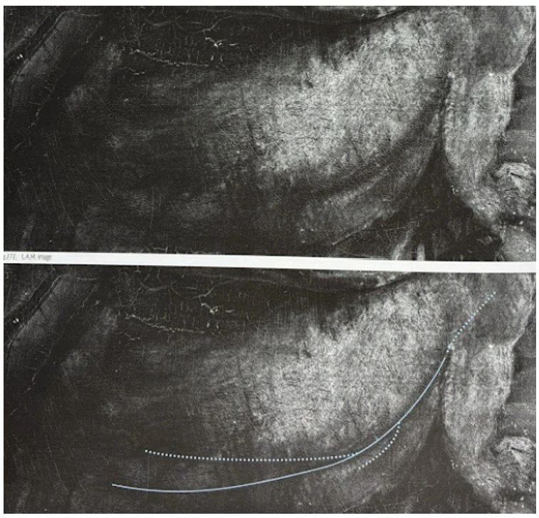
Figure 5. The blue supposedly indicates the lower contour of the skinny ermine of Phase 2.
Pascal Cotte acknowledges that his graphic simulations are conjectural. The images are captioned with a warning: “This simulation does not pretend to have the qualities of Leonardo! It was only carried out to support our hypothesis. It should not be considered a real painting.” However, Cotte underestimates the poignancy and persuasive power of images. In his influential 1980 text Camera Lucida: Reflections on Photography, Roland Barthes characterized the power of the photograph – even when staged or manipulated – as a “certificate of presence.” The viewer forgets that the simulations are curated composites of data, influenced by Pascal’s assumptions. Cotte collapses complexity into a digestible form that is easy for viewers to understand – one that has the veneer of scientific authority – but that creates a misleading impression of coherence and intentionality.
What are the stakes? Art historians have published interpretations based on these visualizations. As part of a complex reading of the painting, one scholar compared the Lady’s pose in Stage 1 – with her crossed arms – to the Madonna of the San Marco Annunciation. Another set of scholars proposed, based on Stage 2, that the ermine is not an ermine at all, but a ferret. Their analysis was due to the gray color of the ferret in Stage 2, which is, of course, hypothesized.
Responsible scholarship, like the 2024 conservation report produced by the Krakow team, often produces inconclusive results, avoids sweeping statements, and maintains an overall conservative tone. In that report, for example, the conservators provided evidence that Leonardo continuously modified his paintings. They did not, however, create a hypothetical reconstruction. Leonardo certainly did not think of his earlier versions as waiting to be revealed by curious conservators hundreds of years later. The underlayers are valuable for understanding the artist’s working process, but should not be mined for the iconography and symbolism that Pascal Cotte’s vivid reconstructions – perhaps unintentionally – encourage. I am inclined to believe that the top layer of the painting – the one Leonardo intended for us to see – represents the ultimate synthesis of his skill and symbolism. As Sir Kenneth Clark wrote in 1952: “The modelling of [the beast] is a miracle; we can feel the structure of the skull, the quality of the skin, the lie of the fur. No one but Leonardo could have conveyed its stoatish character, sleek, predatory, alert, yet with a kind of heraldic dignity.”
Bibliography: Barthes, Roland. Camera Lucida: Reflections on Photography, translated by Richard Howard. Straus and Giroux, 1981. Clark, Kenneth. Leonardo da Vinci: An Account of His Development as an Artist. Cambridge University Press, 1952. Cotte, Pascal. Lumière on the Lady with an Ermine by Leonardo da Vinci: Unprecedented Discoveries. Hoyo-Meléndez, Julio M. del, Marco Gargano, Małgorzata Chmielewska, et al. “The Lady with an Ermine – Portrait of Cecilia Gallerani: Research into Leonardo da Vinci’s Painting Materials and Techniques.” Technè, Hors-Série (2024): 86–99.Saint‑Fargeau‑Ponthierry, 2015.